In a recent Lab, we set up sensors in our office to collect our own machine-generated data (seethis blog post). For the follow-up lab, our team split up into three groups. Two of us set out to implement a nice real-time visualization of our data, another colleague investigated and benchmarked different document schemas for storing time series data in MongoDB (see this post on the MongoSoup blog), while the remaining two started analysing the data we collected.
The sensors we set up delivered two types of data. We dubbed data of the first type (temperature and sound intensity) “stream data”, while we called data of the second type (touch and motion detector data) “event data”. Stream data are characterized by the fact that they are generated steadily, while event data only occur when an event (person touching the coffee machine, walking past the kitchen) triggers them.
Regarding data analysis, we handled the two types of data quite differently. To understand the stream data we applied concepts from time series analysis, while we approached the event data with Markov Chain models. We used R for both approaches.
Analysing the stream data
At first glance, we noted that the temperature data that was written to the database was quite sparse, with lots of missing values. Closer inspection revealed that there are two types of missing values. The first type occured in longer stretches (typically half or full days), while the second type was spread evenly across the whole observation period. Missing values of the first type were due to the Raspberry Pi crashing (duh), while the those of the second type were due to the way the sensors emit data. Namely, if the current value is not different from the one observed 100 milliseconds before, no value is transmitted. While there was no way recovering the missing data of the first type, the values of the second type could easily be reconstructed by replacing the missing value with the last observed value.
In the next step, we coarse-grained the data, keeping only one observation per minute. This seemed reasonable since we didn’t notice significant differences between temperature fluctuations at the 100ms and 1s scales and those at the minute scale.
The following graph shows the temperature data on the minute level from May 14th until May 22nd, 2014 – a period without longer stretches of missing data of the first type. Firstly, we note that during the first seven days, the temperature varies only moderately between 23° and 24° Celsius. During this period, the weather outside was mild but not too hot. You can see some variation of the temperature over periods of 24 hours, but of course this is less pronounced than the variation in the temperature outdoor, since the building is insulated. During day 7 though (May 20th), a trend emerges which sees the average temperature rising. Also, the temperature variation during 24 hours become more distinct. This was when the warm summer wheather kicked in in southern Germany.
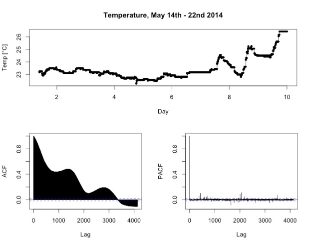
Looking at the auto-correlation function of the time series (lower left panel), you can note distinct peaks at around 1400 and 2800 lags. Since we’re dealing with one observation per minute, those lags correspond to one and two days, respectively. This is to be expected and shows that temperature patterns over 24 hours behave roughly the same for all days. Also, if we hadn’t known in advance what kind of data we were dealing with, this shape of the auto-correlation functions would tell us that 24 hours seems to be a natural time scale hidden in the data.
To better understand the behaviour of the temperature data, we turned to a classical technique from time series analysis, namely an additive decomposition into trend, seasonal and random component. This decomposition is achieved by first applying a smoothing operation to the observed data (typically simple moving average) to extract the trend component. This is then subtracted fromt he observed data. To get the seasonal component, one divides the time series into blocks corresponding to one period (in this case, 24 hours), and then averages over corresponding values in each period. After the seasonal component has been extracted, it is subtracted, leaving only the random part of the time series.

The result of the decomposition is shown in the figure above. The second row clearly shows the trend, with a slight ditch at day 5 and the warm wheather kicking in from day 7.
The seasonal component in the third row shows the variation of temperature over the course of 24h. We note two things: Firstly, it follows the expected pattern, rising from night to afternoon and falling afterwards. Secondly, the absolute variations are quite small, spanning a range of only 0.6 degrees Celsius.
The random component looks slightly weird. In general, the better the decomposition, the more we expect the random part to look like white noise, i.e. normally distributed data. This is not really the case here, since during the first seven days we see a recurring pattern of a drop followed by a period of rising values, and some bigger oscillations at days seven to nine.
A possible explanation is that due to the wheather change on day seven, the variations in the course of one day become more pronounced. This biases the estimation of the trend component, since on three of the nine days, the daily pattern is quite different from the other six. Since there is only one seasonality pattern that is subtracted from the observations over all periods, this causes a model misfit that produces the quirks in the random part.
Analysing the sound data
Inspecting the sound intensity data as the second source of stream data we collected in our office, we found that it is characterized by patterns of short, intense bursts which seem to be distributed quite irregularly over the day, while at night everything remains quiet.
Here’s an example for May 14th – May 16th:

What could be a natural time scale for seasonal effects, i.e. repeating patterns in these data? We tried decompositions of the sound intensity time series data in the fashion described above on various time scales, but could not identify any periods at which seasonality happens, apart from the rather trivial insight that it’s noisier at day time than at night.
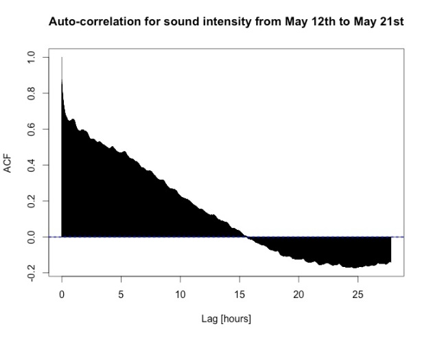
The auto-correlation function ACF (data from May 12th to 21st, aggregated to second level, frequency one hour) confirms this. Although there are some smaller bumps, distinct maxima are lacking. The decorrelation length, i.e. the point at which the auto-correlation crosses zero for the first time, is roughly equal to 15 hours, and even at 24 hours the auto-correlation is negative instead of positive, indicating that even 24 hours is not a natural time scale for the data at hand.
After all, the pattern according to which people move around the office and produce noise seems to be quite irregular.
Nevertheless, we noticed something interesting in the decomposition of the data from May 16th with a period of 15 minutes (see below). Namely, in the night there seem to be small peaks at a regular period.

Taking a closer look by isolating the data from the night between May 15th and May 16th and calculating the auto-correlation function confirmed this:
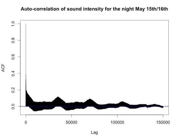
There are distinct maxima at the lags corresponding to one hour, two hours and so on. Our conjecture is that these peaks are caused by a church bell ringing nearby.
Analysing the event data
The event data we analyzed came from several sources: Touch sensors at the handles of the coffee machine, the fridge and the toilet door, as well as a motion sensor which was placed at the corridor between offices and kitchen / toilet.
The following diagram shows the steps we had to perform in the preparation phase before we were able to analyze the event data by fitting it to a Markov chain.
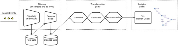
Filtering
In the case of event data the raw data of the touch sensors caused some headache as the sensors are electrodes and influenced by the surrounding environment and natural electrical variations. This caused a lot of “flickering” and bogus events. So we needed to do various filtering steps.
The Tinkerforge multitouch sensor offers the possibility to set a sensitivity and recalibrate the sensor. Decreasing the sensitivity helped reducing bogus events, but the sensitivity could only be set once for all electrodes connected to the multitouch bricklet. Since we have varying cable length between the electrodes and the multitouch bricklet, the sensitivity would have to be set individually. So we still had a lot of short “flickering” events in the database, which lead us to the next step
In the next step we did a pre-filtering on the database level for the multitouch sensors. These filtered events were written into a new MongoDB collection keeping the original schema. This step was done once and was sufficient for our static analysis. For a real time analysis we need to think of a better solution.
Specifically, events below the following durations were filtered out:
- Toilet door sensor: 800ms
- Coffee machine sensor: 600ms
- Fridge sensor: 600ms
These thresholds were defined after comparing the duration of events during the night to the standard duration triggered by human usage which usually results in events of duration above 1000ms.
Transformation
After filtering the events we had to transform the data so it could be used for a Markov chain analysis of the sensor states. As we use R for this analysis, we also used R for the transformation.
We read the filtered events from MongoDB (using the rmongodb package) and extracted the states for every sensor and every second. This results in an overall state which represents the combination of single sensor states for every second. Additionally we defined a zero state for the situation in which no sensor events occur.
Compression
For the analysis we were only interested in the transition probabilities between states and not in the duration of events. So we compressed succeeding identical states into one single state. This had the additional advantage that the noise introduced due to flickering events could be further reduced. Here the zero state helped us to do some kind of start-stop detection of events. After a zero state has occurred it is of course possible to move into the same sensor state again.
These steps lead to the following data format, which is modeled by a data frame in R (1 = sensor on, 0 = off):
timestamp motion toilet fridge coffee state
1400659392 1 0 0 0 1000
1400659397 0 0 0 0 0000
1400659403 1 1 0 0 1100
1400659410 0 0 0 0 0000
1400660442 1 0 0 0 1000
…
1399505901 0 1 0 0 0100
1399506127 0 0 0 0 0000
1399506128 0 1 0 0 0100
1399506424 0 0 0 0 0000
1399506933 0 0 0 1 0001
Remove overlapping events
Since several persons move around in the office at the same time, a lot of events overlap. For the analysis of transition probabilities we focussed only on events which can be triggered by the same person one after the other. So we focussed now only on the states: “toilet on”, “motion on”, “fridge on”, “coffee on” and “motion on & toilet on”. The state “motion & toilet” can be triggered by one person because the motion sensor is always on for about five seconds and in this timespan the toilet door is opened, which is within reach of the motion sensor. This step is a strong simplification, but yields plausible results as shown below.
Markov chains
After having done the filtering and transformation we could use the R package markovchain to analyse event transition probabilities by simply calling
github:c338aa278256a8e3e00f
where “states” contain our transformed sensor data which are fitted to the underlying Markov chain distribution by Maximum Likelihood Estimation (MLE).
The result is a matrix with transition probabilities from one state to another. The markovchain package also provides a plot method for the transition matrix which plots the matrix as a graph.
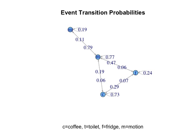
In the graph displayed here we excluded the “toilet” states, since they were still to noisy and with “motion+toilet” we have a state which should be equal. We further removed all edges with transition probabilities below 0.03.
The result is a graph which fits quite well to the expected behaviour:
- Every event is strongly related with motion
- Coffee and fridge events are strongly related with each other
Given that every event is related to a previous motion (as our physical setup requires) we detect 23% of the destinations of motion (given that the state sequences don’t overlap). Undetected are for example people going to the printer (which is next to the motion sensor). For further analysis – and given the peculiarities of the sound intensity data discussed above – we want to define sound events based on certain sound intensities, which should enable us to detect printer events.
Another idea for improvement would be to use the transition probabilities and try to detect overlapping event sequences, so we don’t have to filter out the events as described in step 5.
Simulation
Another interesting feature the markovchain package delivers is that we can simulate sequences of events given a start state and a (fitted) markov chain.
So if for example we start with the most common state “motion” and simulate the next 10 events:
github:6a50cc6fe5942637364f
We get the sequence
github:1d7b5fcdf0db7f0acc17
which can be interpreted as follows: “Someone went from his desk to the kitchen (start state ‘m’), opened the fridge, opened the pad slot of the coffee machine, closed it (and probably started the coffee machine and got his coffee) and went back to his place” and so on. This one simulation seems to be quite reasonable. Another simulation run shows another result, e.g.
github:44e40a7fa50b24764521
nGram analysis
In addition to transition probabilities between two states also probabilities of longer sequences are interesting. E.g. the coffee machine handle is used two times when making coffee (opening and closing), and then the fridge is opened or vice versa. So we did a short trigram analysis (i.e. analyzing the distribution of frequencies of three successing states) with the R package “tau”. Here e.g. the triple “coffee -> coffee -> fridge” was slightly leading in comparison to “fridge -> coffee -> coffee”.
Conclusion
All these results are only examples on a small sensor setting and can get more interesting and valuable with more complex setups.
However, we think that our analyses confronted us with many of the challenges and peculiarities that characterise real-world sensor data. And – as mentioned above – one of the most important lessons we learned is that data modelling and data preparation are such crucial ingredients to data science projects that they decide upon the fate of the whole endeavour. Looking back, we think that within our setting (time- and equipment-wise), we handled them rather well.
We’ll continue this series of blog posts as the sensor projects keeps evolving…